So is the 25th March 2010 and its my daughters 4th Birthday; HAPPY Birthday Bethan. :-) and after a wink and a nod from Autodesk I can also finally reveal what's new in 2011! No, not the year, but this year's release of Autodesk Revit Architecture. Having spent the last 7 months participating in the alpha and beta program, I am genuinely excited about this release. But then I am always passionate about a new release of Revit, as it opens up new opportunities, gives us new toys to play with and helps drive the adoption of BIM within our industry.
So what's in RAC 2011 you may ask? RAC 2011 introduces some new concepts, an improved interface (needed too after the grief that Autodesk got about the Ribbon for 2010) as well as some genuine user feature requests. Whilst this blog just covers the main features it does not cover everything, but I do plan to cover specific functionality in future articles.
Ribbon and UI
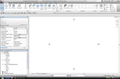
So let me start with the interface, as this has been a constantly debated, argued, discussed subject amongst many a Revit user on the AUGI forums. So these are the headliners for UI improvements.
- Contextual Tab display
- Contextual Tab display behaviour
- Modeless Properties Palette
- Modify Tab is both static and contextual
- Modify Tools improvements
- Quick Access Toolbar customization
- Resizable Dialogs
- Worksets and Design Options
The most obvious improvement and a complaint I personally had with 2010, was actually getting access to modification tools. 2011 allows rapid access to modification tools, no more clicking backwards and forwards between Ribbon tabs. When you select a tool and start to work with it, the modify tools are constantly at hand. The Ribbon also seems to be a lot faster and there is icon clarity with other Autodesk solutions. The other obvious change is the disappearance of the Type selector from the Ribbon. This is not going to be to everybody's taste; as it now resides in a modeless Properties Palette.

The QAT is now customisable as it has its own dialogue box which allows you to reconfigure tools quickly if required. Other noticeable changes to the UI include resizable dialogs as well as a workset and design options improvements. The latter can be easily accessed from the main window without having to hunt through various ribbon tabs.
Worksets and Linking
A number of enhancements have been added which will assist those that use workset as well as linked files. A linked Revit model viewed By Host, will set the visibility of linked model worksets which share the same name as your host model worksets to the visibility of the host model worksets in that view. In view Visibility Graphics under the Linked Revit Models tab, linked model worksets can be individually turned on or off . A new Manage Worksets Tab within the Managed Links dialogue also allows you to open or close worksets in a linked model file. These linked management features are an absolute god send and will save you a lot of time when managing large linked datasets.
Workset visibility has been given far greater control on a project-wide basis. The Worksets dialog now offers the option to change the visibility of a workset globally. The Worksets tab in individual views has been improved to allow the per view workset visibility to be visible, not visible or to follow the global setting. Trust me, if you use worksets and linked files, these improvements alone are worth the subscription renewal, even in these financially difficult times. Whilst there is still much to do improving Revit at all levels, (please don't get me started on limited site tools, stairs and railings :-) ), workset and linked file improvements really start to help to address the need to define sub models when the Revit model gets too large to handle in one super model. To help with performance , speed improvements have been made and a project which has been upgraded to 2011 will now benefit from a multiple threading thus improving opening times.
To support the linked model approach, linked models can now be tagged. A new management feature has also been included which allows the user to track and watch if Tags lose their hosted elements. The Reconcile Hosting command opens up a new browser allowing you to decide what to do if a Tags does loses its host.
Graphic Display
In RAC 2010, Autodesk migrated from OpenGL to Direct 3d. This has allowed further graphic improvements to be made in RAC 2011. If you have a supported Graphics card you will be able to enable Ambient Occlusion, which is accessible via the Graphics Display Options dialog box. Those that are familiar with using visualisation tools such as 3dsmax will know all about Ambient Occlusion. I suppose the best way to describe Ambient Occlusion is that it adds realism to models by taking into account attenuation of light due to occlusion. Ambient occlusion attempts to approximate the way light radiates in real life, especially off what are normally considered non-reflective surfaces. Look in a room at the corners between the wall and the ceiling; you will notice the soft shaded falloff of material colour which is not defined by the sun, this is Ambient occlusion.
Two additional view styles have now been added to the View Control Bar, these include a Realistic View which will display materials and textures defined to elements in real-time. You also have a Consistent Colours view styles, which displays colours in a constant manner across all faces of the model in a 3d view.
Realistic View
Consistent Colours
To get the real benefits of these new graphic features you are going to need a supported graphic card. If you have a relatively new card which supports Direct X, you should be ok. My laptop is a Dell E6400 latitude with Windows 7 (64bit) and a Quadro shared graphics and it worked fine.
Conceptual Massing
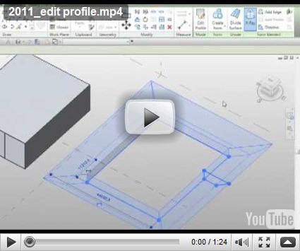
If you have read my blog in the past, you will know I am a big fan of the conceptual massing tools introduced in RAC 2010. However, one annoyance in 2010 was the loss of the sketch mode when creating forms. Rest assured it totally confused the users in my office! So after listening to user feedback, Autodesk have reintroduced the sketch mode back to forms created with lines. You are able to edit the profile of a form and the geometry automatically updates. This works with revolves, extrudes, blends and sweeps. If you choose to lock profiles the change is made to the top and bottom profiles. This is a excellent addition and combines the best of old school massing with new school massing approach.
You can now dissolve a form using the new dissolve function. Say you build a form from lines or reference lines and you decide you want to take it back to the line work it was originally created from. Just select the form and choose dissolve. Once a form has been dissolved the surface created is lost, however the profiles and path remain, allowing you to edit these and recreate the form after you have made any adjustments.
A new feature called the workplane viewer has now been included, making the editing of profiles within a form a lot easier. This is a floating dialog 
The divide surface tools introduced with the new conceptual massing tools in 2010 has been further enhanced and you can now divide a surface by intersecting levels, reference planes and lines drawn on a reference plane.
RAC 2011 also sees the introduction of a new family called the Adaptive component family, to be honest this is one of my favourite features in 2011. It expands the conceptual massing tools further and I am really looking forward to using this new family type within projects. Described by Autodesk; the Adaptive component resolves the issues related to stitching border conditions of divided surfaces. It also address the problems of creating and placing pattern component panels (triangular, pentagonal, hexagonal, etc.) on non-rectangular and non-evenly spaced grids. The adaptive components can also be used to create a repeating systems generated by arraying multiple components. When you place a point in an Adaptive family you can define whether 
One feature which may go unnoticed is the ability to do a solid - solid cut on two forms. described as follows; You can cut out one solid from another, but the resulting form is not a geometric combination. When the Cut tool is used on 2 solid forms, the result is separate geometry. It certainly makes for cleaner geometry.
To improve the 3D working environment, you can now use the align tool in 3d as well as 2d. You can use a node, vertex, edge, surface form or level as your target, then all you need to do is pick then element you wish to align.
Parameter enhancements
I regularly tell users that it's the "I" in BIM which is one of the most important assets of the BIM process. So being able to extract data from your Revit model so that it can be used
Rendering
Mental ray rendering was introduced with RAC 2009 and generally it's been a hit with Revit users. Certainly the quality of renders I have seen has been superb. But to some extent quality was limited by desktop power, with rendering being limited to 4 cores only. This meant, that you may have a super all bells and whistles workstation with processors multiply , but the 4 core throttle resulted in Revit no
Everyday wish list items
I guess one can assume that Autodesk must have a room somewhere in the factory which is full, from floor to ceiling with user feature requests for inclusion within future releases of Revit. Whilst we all have our favourites, development time, budget and technology restrictions often mean that they are not immediately viable. However, RAC 2011 has included a number, which will be real time savers in my opinion. We now have Repeat last command, which can be accessed off the right mouse contextual menu or enabled via a keyboard shortcut. The contextual menu also now lists the last five commands you have used.
You can now select instances across a view as well as across a project and temporary dimensions can now remember any edits made to witness lines per session.
There have been a number of enhancements made to text notes, with better control of leader placement. Text notes can now be enclosed with a box with the option to change the text margin between the text and box.
DWG export from Revit has continued to be a contentious point, with the quality of the output not always meeting expectation. However, it really does depend on what your expectation are. I have always been of the view that whilst the output was ok, it would never be as clean as if you where to have drawn it from scratch in AutoCAD. With this in mind and understanding the benefits of what Revit provides, really a DWG export is just a snapshot in time. But I also realise that there are some fundamentals issues when exporting to DWG. Autodesk seemed to have worked hard in this particular area and models which we had, which refused to export to DWG in previous versions of Revit, now happily export as expected and the graphic fidelity is a lot better.
Aligning views in a consistent manner on drawing sheet has also been a general pain in the backside. Those that have come from an AutoCAD background ( I would guess in many cases that's around 95% of us) have found the 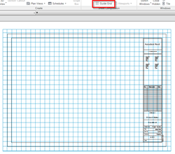
Sustainability requirements
One of the key benefits with BIM is the ability to use the model to meet the ever increasing sustainability requirements. Whether you believe all the discussions about global warming that the governments and scientist talk about, is a matter of opinion. But one thing is for sure, as an industry we need to be smarter about how we design buildings and we need to reduce the energy consumption of our buildings. To analyze a building, typically you need 3D data. 
The End
So that's it folks. A quick round up of what new in Revit Architecture 2011. There are other minor functional improvements in this release which I haven't covered such as the sheet list, family editor tweaks, but I am sure you will discover these soon enough. I hope you found this commentary useful and it gives you a good insight into what will be landing on your desktops any time soon. Now back to the birthday party for tea and cake. :-)





No hay comentarios:
Publicar un comentario